Home Decor

Before and After

Let's face it, everyone loves a good Before and After. Whether it's a haircut, a fashion choice, or a home remodel – it’s fun to see something lackluster transform into fabulous!

In my profession, I have the opportunity to facilitate transformation every day. In fact, it's a favorite aspect of my job. I see it so frequently that I can picture 'after' in my mind's eye long before it happens. This vision guides decisions on the path to the end goal.

Because it comes easily for me, I sometimes forget that not everyone can imagine these possibilities or even knows they’re possible. For that reason I thought it would be fun to share some Before and After shots from past projects with you. In each case note the improved space, light, and functionality. Some were additions and re-orientations – others simply a removed wall and updated surfaces. Looking back reminds me that it was a rewarding journey. Check out a few examples below:

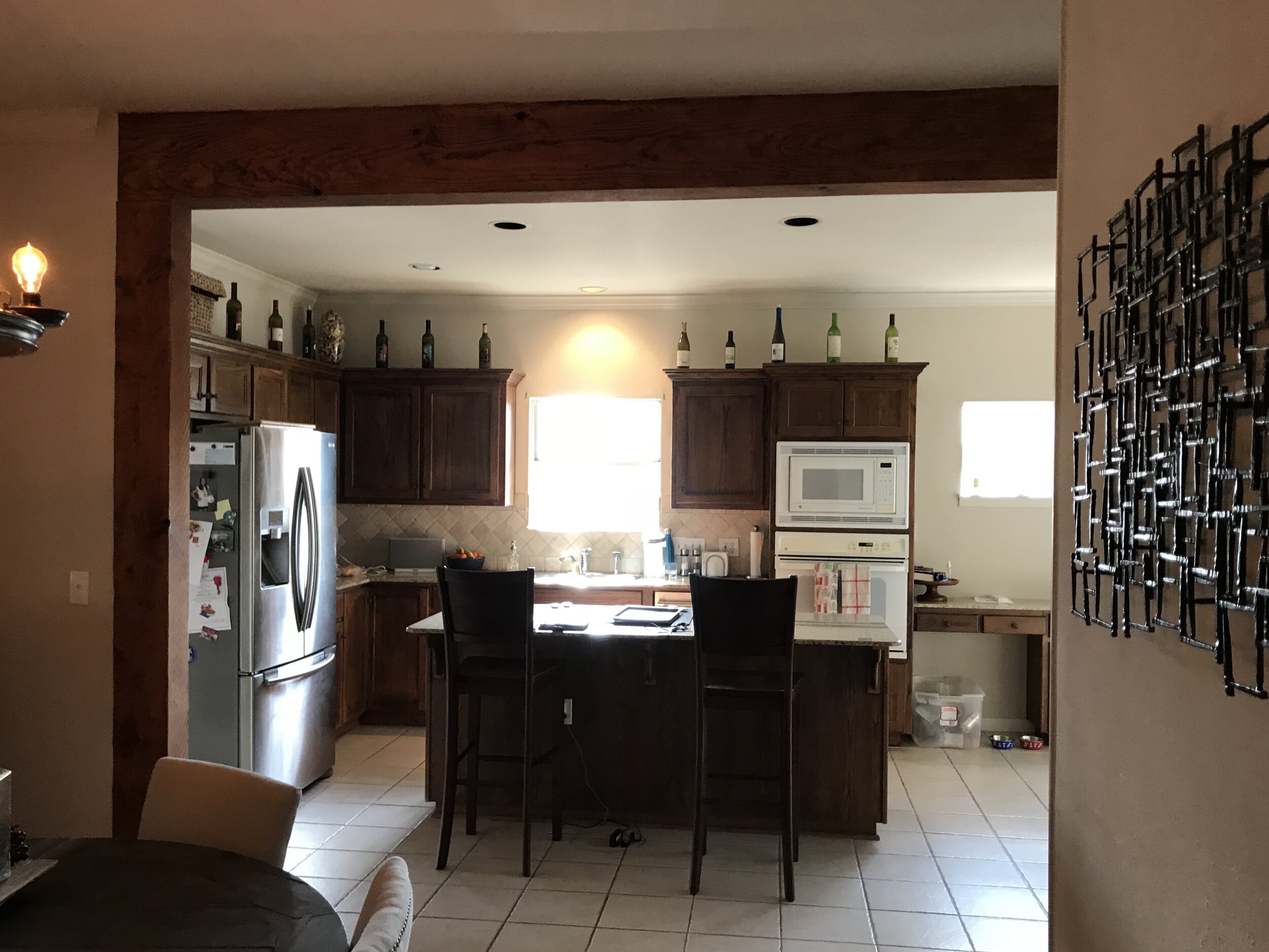
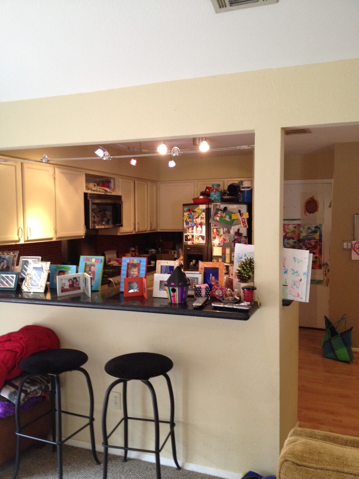
CASE STUDY ONE - WALL REMOVAL

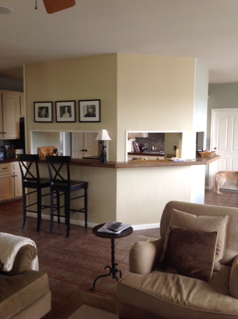
The kitchen above was separated from the living and dining areas by an L-shaped wall, limiting natural light and constricting the traffic flow. Removing the wall (which had a load-bearing component, hence the remaining column) allowed for better light, easier entertaining, and over-all improved functionality. ('After' photo by An Indoor Lady)

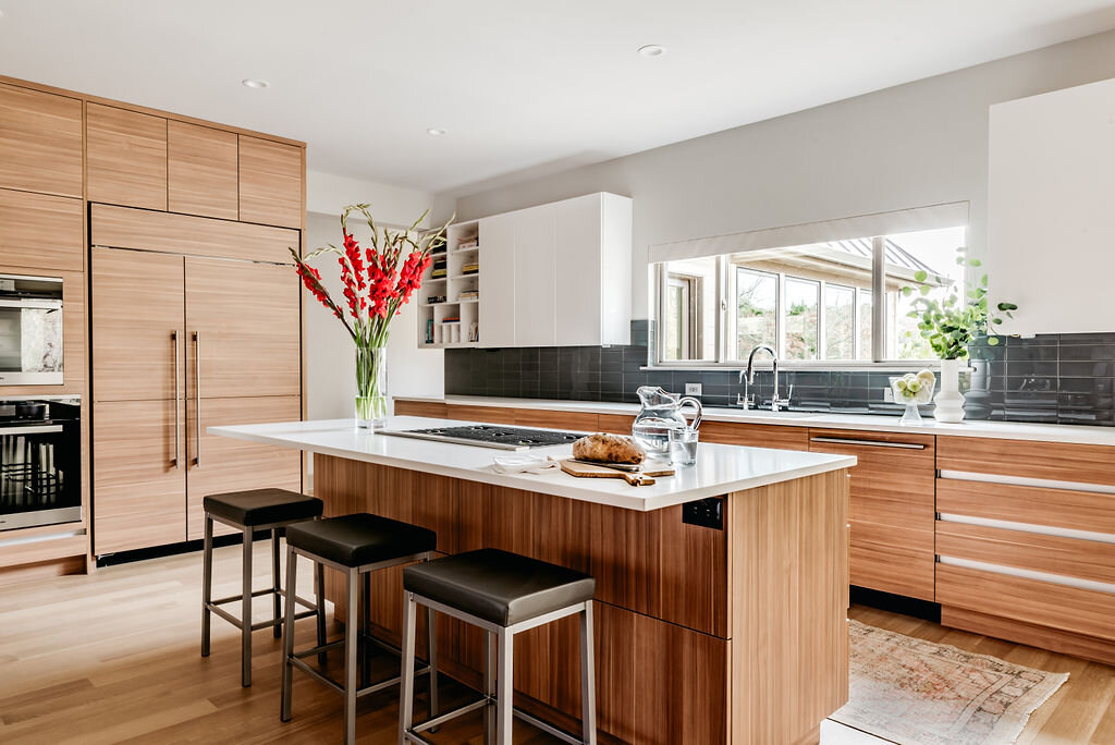
CASE STUDY TWO - EXPANSION

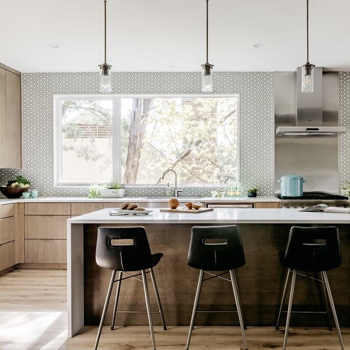
These clients had a decent sized kitchen, but wasted, unused space due to an oddly placed window and kitchen “desk” that was not functional. We removed the small window, maximized the main window, and completely revamped the layout with all new cabinets, appliances, and surfaces. ('After' photo by An Indoor Lady)

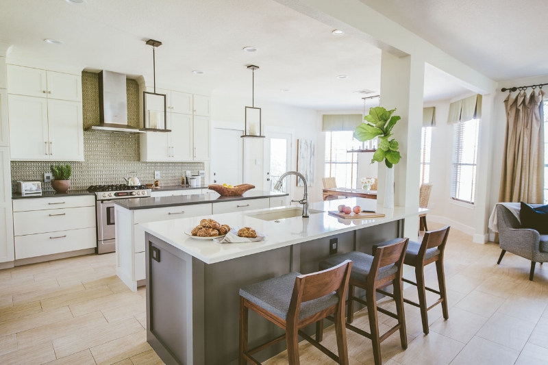
CASE STUDY THREE - RELOCATION

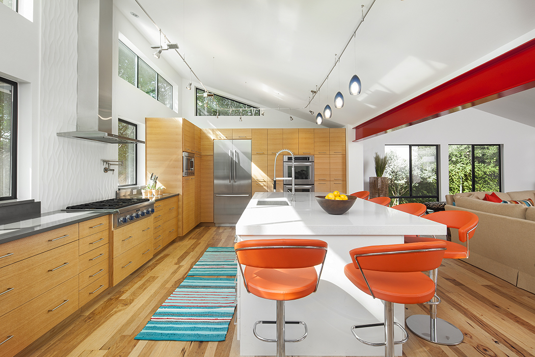
The kitchen above was cramped and poorly located, with little opportunity for light or space. By opening an exterior wall at the back of the house and expanding into the yard, we carved out square footage for a grand kitchen addition with tall ceilings and improved storage and amenities. ('After' photo by Fine Focus Photography)

CASE STUDY FOUR - SURFACES

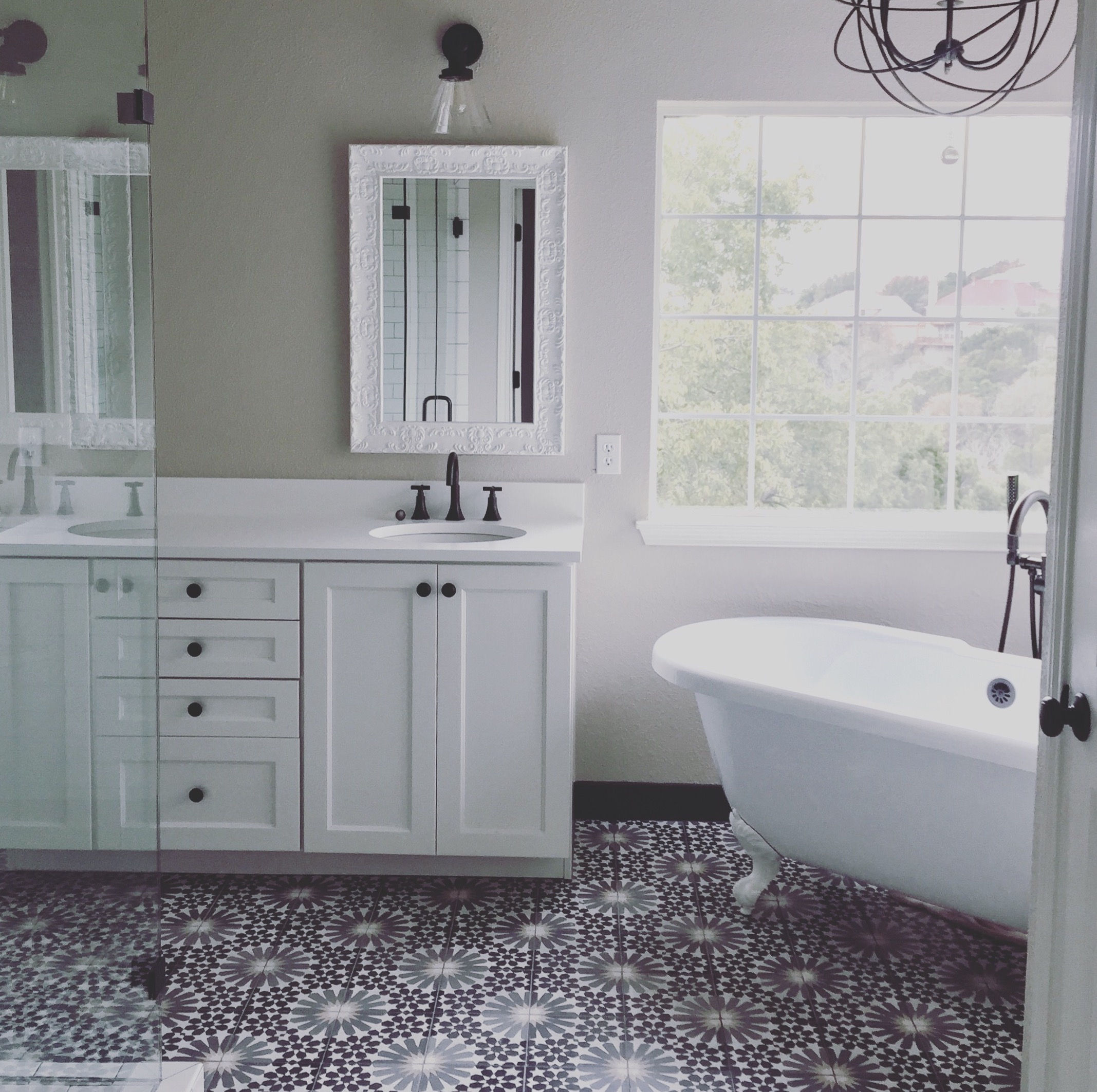
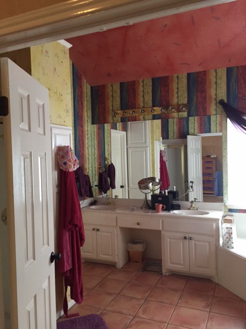
This last one is fun because it is small and recent and just so dang cute! I love this sassy little bathroom remodel. The main objective was to update surfaces, but we also enlarged the shower, maximized storage, and improved lighting and general functionality.

Has there been something about your space that bothers you, or you just feel the need for a refresh? Hopefully these photos will inspire you.  Imagine the possibilities for your home!

Less is More

Mies.jpg

Last week I visited the Mies van der Rohe Pavilion in Barcelona. Mies is the architectural icon who coined the phrases “Less is more” and “Form follows function”. These are two of my favorite design philosophies.

DESIGN FUNDAMENTALS

My belief is that good design requires minimal ornamentation or ‘decoration’. It might seem counter-intuitive for a designer to be saying this, but for me the feeling of an interior is largely defined by elements such as flow, light, texture, and function. Don’t get me wrong – the right furniture and fixtures are important and can enhance or detract from the experience in a space, but there’s a fine line between interiors that are too sparce versus over-complicated. It’s a delicate balance.

STUFF

In our Western world today we accumulate so much stuff. Managing it is a constant challenge. I have read a few books on Feng Shui, and a concept that resonates with me is that 'clutter in the home is like clutter in the soul'. Wow – that’s powerful! Studies have revealed strong links between clutter and depression. It reminds me of a little story…

SALE-ING

I have a loved one (who shall remain nameless, but she remembers the occasion well) and one day I walked into her bedroom and immediately burst into tears. I don’t know what came over me (it was a little embarrassing) but I saw the assortment of tables, curio-cabinets, chairs, etc. piled up with receipts, bills, flyers, magazines – suddenly I couldn’t breathe! You see, she was a “collector” of sorts (she liked to say that her hobby was “sale-ing… GARAGE sale-ing”), but despite keeping a sense of humor, she was depressed. I could immediately feel the link between the collecting behavior and her emotional wellness. That stuff had to go. I offered to help get rid of it, and she was thankful, because sorting through it can be over-whelming.

JUST DO IT

So here’s this month’s challenge – get rid of stuff! Okay now I've inspired myself, so I'm going into my study to tackle those piles right NOW!

Good luck, have fun, and be sure to share with me how happy you are afterward.

Design Personality Disorder

Photo by Getty Images

Photo by Getty Images

So, this is embarrassing. I'm going to describe a décor trap that I am all too familiar with, because it happened to ME (quick side note – many of the issues in my blog will be about lessons I have learned not only through years as an interior designer, but through experiences with my own home). Okay back to my story: when my husband and I were married in 1994 we bought our first house. We were enticed by the neighborhood and the views, and despite having a degree in architecture, I was young and new to being a homeowner. The house was lovely but spec home quality, and very traditional. I didn't really make a conscious recognition of the style of the house at the time.

WHERE AM I?

After a few years the trends in design changed and I began to think that I liked Mediterranean-style (probably because I saw it in all of the magazines and stores!). I started decorating my home not thinking about the architectural style of the house, but just buying things that I thought seemed cool. I ended up with curvy iron light fixtures, terra-cotta planters, and I even replaced our tile (yep – LOTS of it!) with a cheap version of something meant to look like saltillo tile. In a traditional brick house. What? (I told you this was embarrassing!)

The result is what I will call a house with a “personality disorder". It had veered from it’s true identity, and the mojo of the house had definitely gotten lost along the way...

THE FIX

After years of trying to figure out what wasn’t working, one day it hit me - I needed to get back to the roots of the house! Unfortunately some of the changes I had made were not inexpensive to fix, but I vowed to get back on track with each small decision that was made, hoping that one day I could make major progress.

Then a few years ago we committed to a major renovation. Out came my ‘inspiration’ notebook (many years of clippings had accumulated before Pinterest came along!) and the vision in my mind became a reality. Now I really love my house. It’s not fancy, but it makes me happy and it finally feels cohesive.

WHAT STYLE IS YOUR HOME?

Take some time to think about the architecture of your home. Is it Traditional? Contemporary? Ranch Style? For those of you who don’t know I’ll provide tips on that down the road. Then consider the interiors and take note of fixtures, finishes, or furnishings that are in conflict with the style flow. Now, there is a chance that some of you might say "my house is traditional, but I prefer modern". That's okay! Mixing styles is not impossible, it just takes a certain skill and finesse. It can be lovely if done well, but the key is to first know what your house is and have a plan for where it should go.