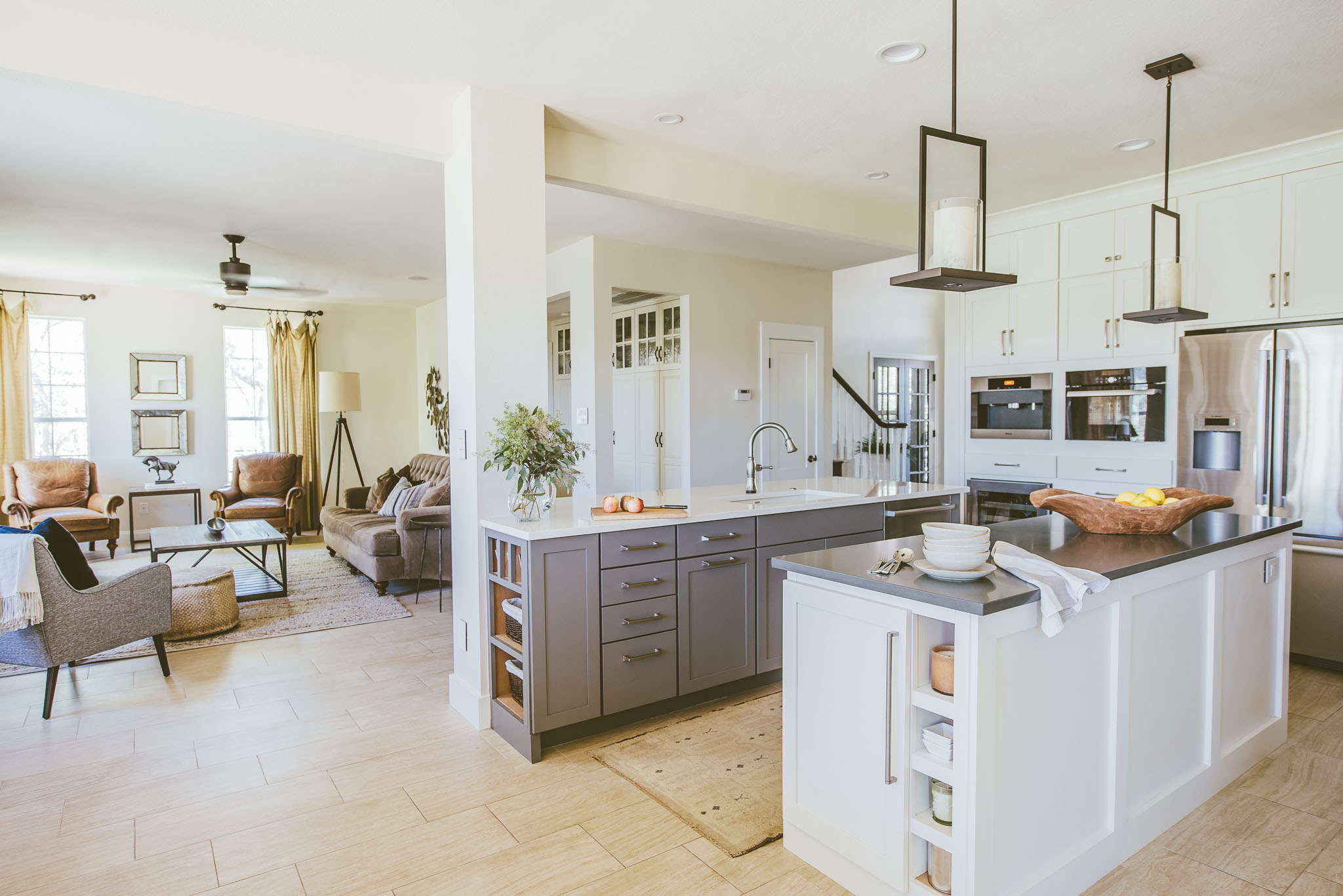
Photo by An Indoor Lady
I have written about consistency in design, and finding your own style while making sure it works with the bones of your home. This post is a guideline for how to determine the architectural style of your house.
LITTLE BLACK DRESS
First, let's start with a fashion analogy. Imagine a woman in a conservative black dress. As a safe choice, she might pair it with pumps and a pearl necklace. Or, if she is a little more daring, she might wear interesting shoes or dramatic jewelry. You would not, however, expect her to wear brown suede boots with fringe. It just wouldn't be right. Why then, do we feel tempted to fill our homes with decor that is equally inconsistent with the core style of our house? For the purposes of this blog, consider the architecture of your home is ‘the dress’. It is the over-riding style driver that dictates what type of interiors and decor will coordinate well and feel right. Now let’s dig deeper into some architectural details.
HOW DO I KNOW THE ARCHITECTURAL STYLE OF MY HOUSE?
I get this question often. It’s true that there are many gray areas in residential architecture, and houses don’t always fit neatly into one category. I am going to list some key styles and characteristics below (for those of you who are architecture buffs - please allow me some leeway. I know this is over-simplified!), and in the interest of making it easy, if your home has 3 or more items from any one description, it is likely in that category. Okay here goes:
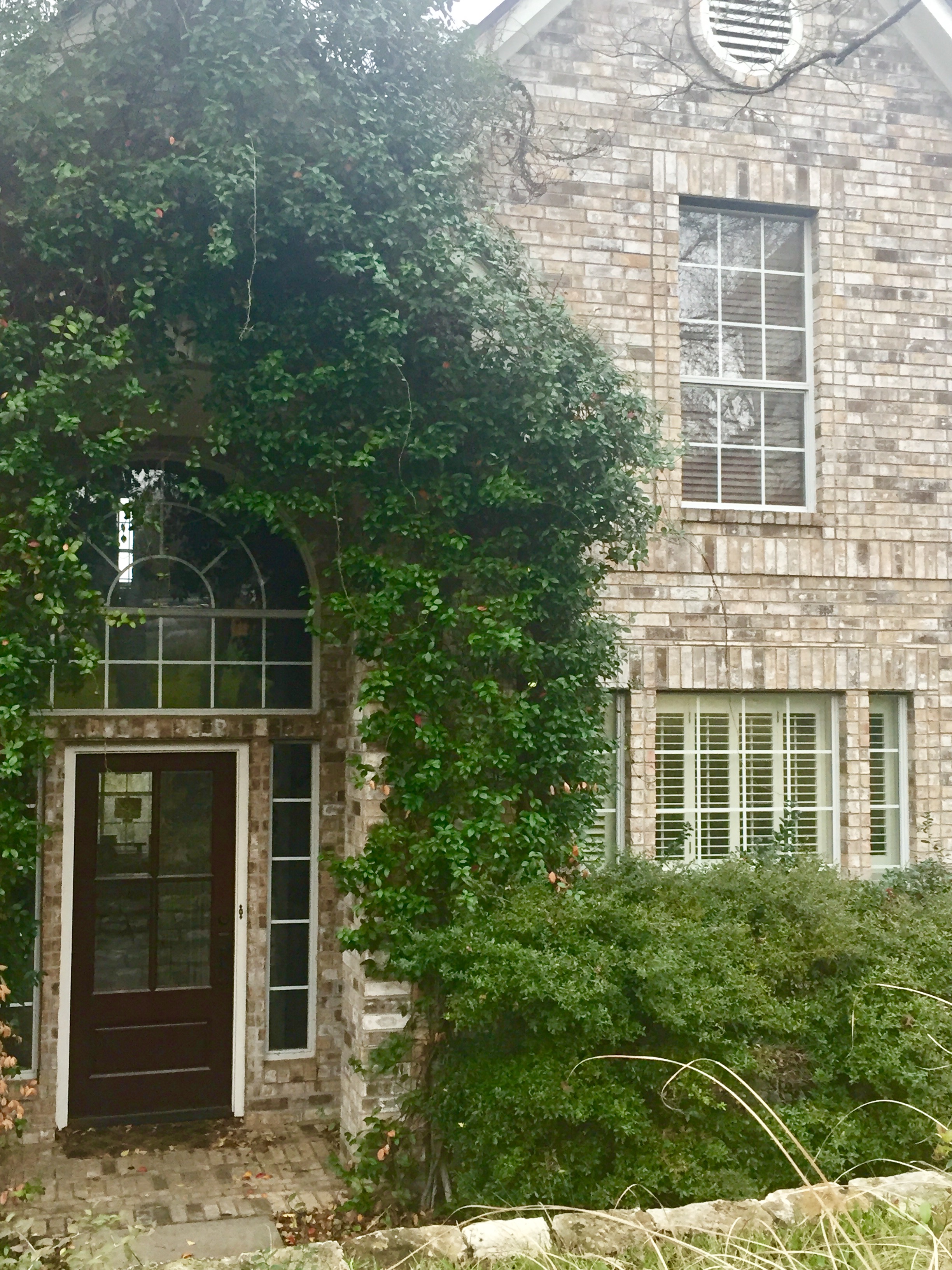
Traditional - this style varies depending on the region, because it has historic reference to the popular style of that area. I would venture a guess that over 60% of the houses in Austin fit the description below:
- gabled roof (often two-story)
- combo of either brick and lap siding or limestone and lap siding
- arches, columns, shutters
- divided lite windows
- sheetrock and trim details on the interior
Here is my traditional house - it looks like most of the other houses in the neighborhood.
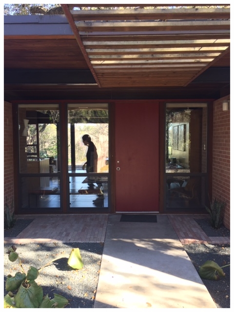
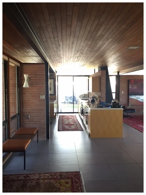
Modern - this style pertains to a specific movement that started in America in the middle of the twentieth century. Architecture buffs love it (myself included). It feels honest, pure, and simple. Here are some features:
- flat roof
- large windows (often floor to ceiling)
- frequent use of metal and wood
- minimal ornamentation
- focus on space, simplicity of architecture, and natural materials
These are examples of a Modern 1950's home in Austin designed by a local architect.
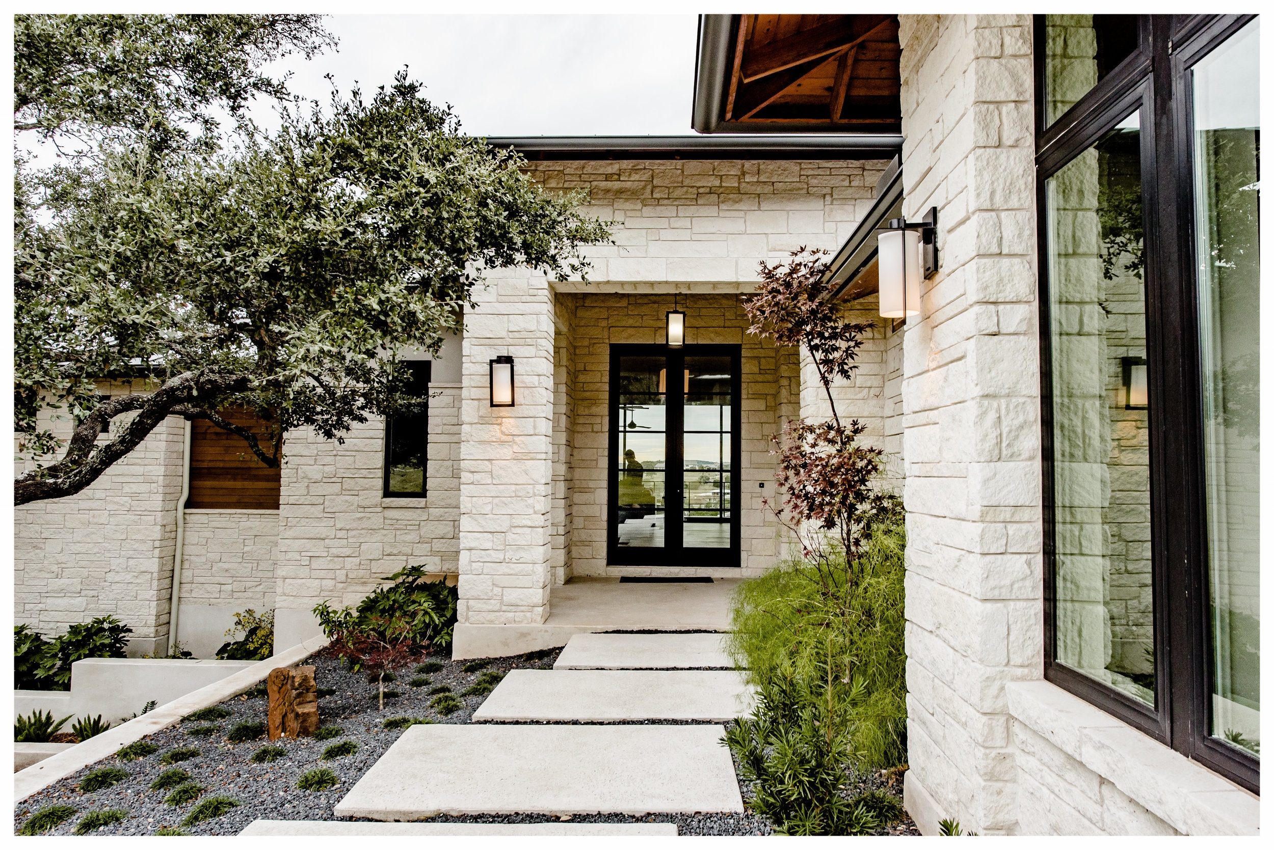
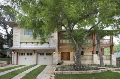
Contemporary –this is often confused with modern, but they are different. Contemporary design follows current trends and is not anchored in the mid-century. It changes over time. Currently it can be described as follows:
- clean lined roof and architecture
- large windows with a special focus on views
- natural materials (in Texas it is often limestone and cedar)
- more focus on warmth and comfort than true Modernism
If your home shares characteristics between this category and Modern, but wasn’t designed in the mid-century or directly modeled from it, it is most likely Contemporary.
This Contemporary house is a new construction project of ours designed by Kai Geschke, built by Enve Builders, and photographed by An Indoor Lady.
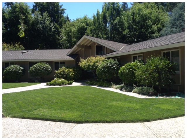
Ranch Style – this style was popular in California and Texas (probably because it is spacious and sprawling, which makes sense where there is land) and seemed to be a style of choice in the 60’s and 70’s. Some characteristics are:
- single story, predominantly horizontal
- gabled or hip roof
- a combination of stone, stucco, brick, or siding
- sometimes arches, often vaulted ceilings
- large windows
These Ranch Style examples are from a remodel project of ours in CA (house built in 1978)
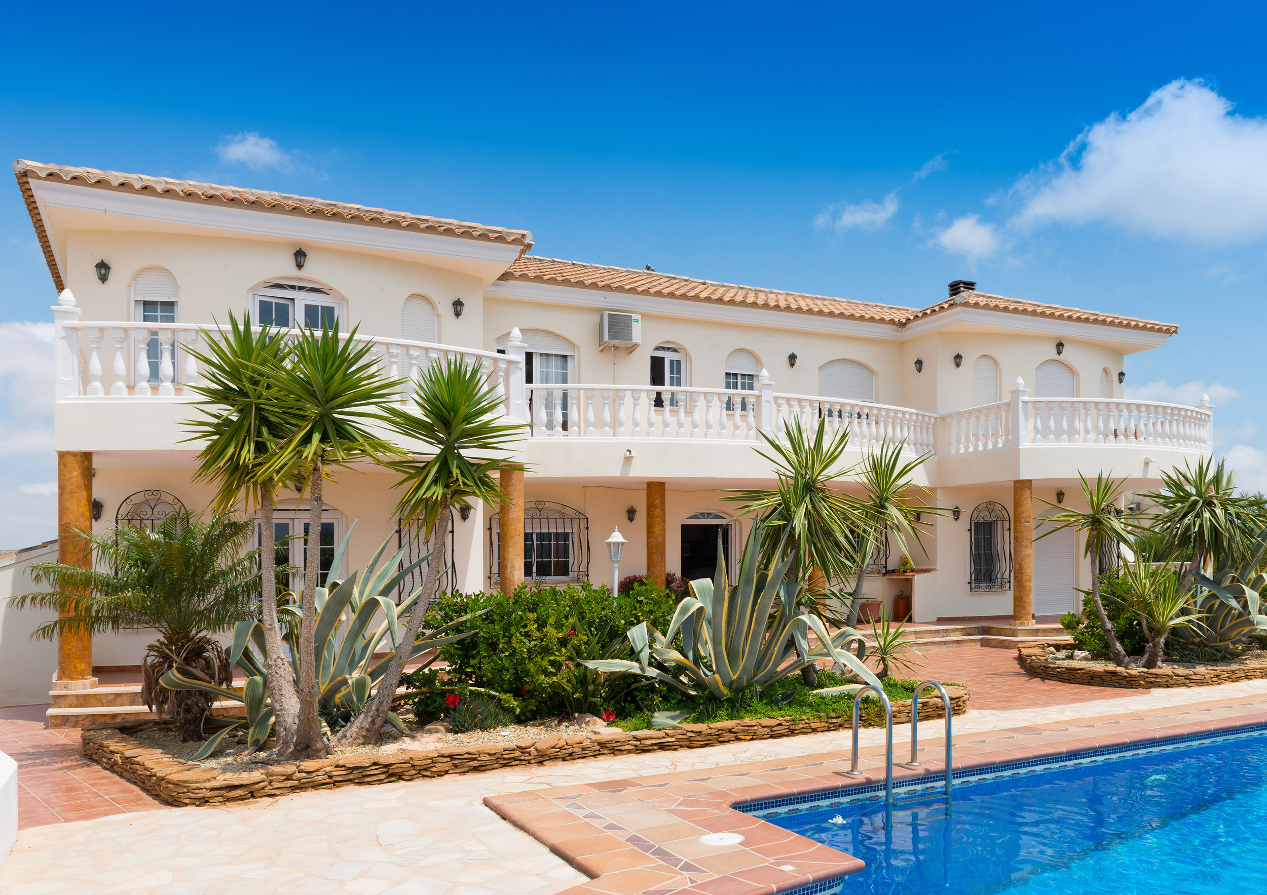
Spanish – this style is fairly eclectic and there are many off-shoots and versions. It was popular in the early 1900’s in the western U.S., Florida, and Texas, and made a resurgence in the 90’s. It was originally inspired by Spanish Colonial architecture but later took on Mediterranean touches as well. Here are some popular features:
- gabled or hip roof (often clay tile)
- light colored stucco or stone
- arches, curves, and interior ornamentation
- focus on tile and natural materials, frequent use of iron
This photo courtesy of Getty Images is a home in Almeria, Spain
Tuscan - this is a near relative of Spanish that takes root in old Italy. It has similar characteristics but is more typically stone than stucco. Unfortunately a version of it that took off in Texas in the early 2000's became cheapened and over-used and now has negative connotations. If done well it can still be quite charming, but there are too many poorly done examples in Austin. If you have one of these don't despair - there are suggestions I can make for injecting quality and character.
Craftsman – this style took off as a result of the Arts and Crafts movement and flourished in America in the early 1900’s. The philosophy was focused on quality, nature, and simplicity of design. There are several versions of this style as well (you may have heard of Bungalows, Prairie Style, and Mission Style?) but some simple characteristics are:
- gabled roof (often with wide eaves and exposed rafters)
- expansive porches and tapered columns
- stone, board and batten, shingle or lap siding
- special attention to trim, often highlighted by color contrast
This fresh version of modern day Craftsman was a project of ours in Westlake. Architect is Heimsath architects, photographed by Whit Preston.
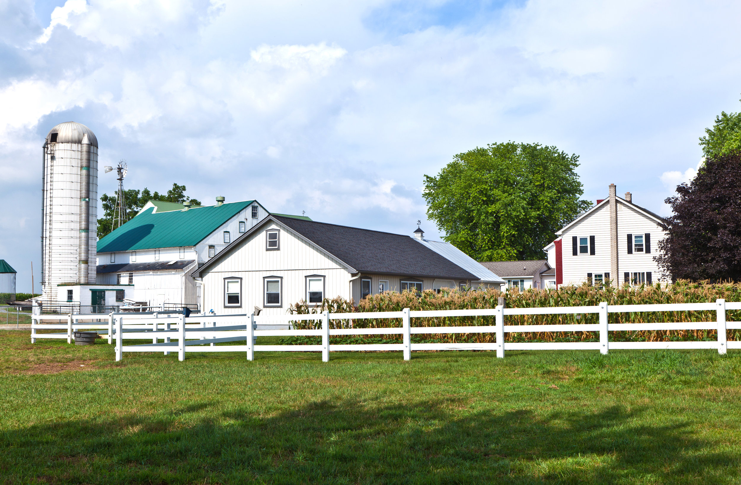
Farmhouse – okay, this is the last one I am going to cover, because… Fixer Upper! I know, I was resistant at first, but I’ll admit it’s fun to watch. And Chip and Joanna Gaines have called new emphasis to this style in Texas. Now, philosophically I can’t say I agree with transforming any old run down house in Waco into a ‘farmhouse’, but I’ll agree the couple is talented and I love what they have done for that town. Oh yah, and they’re pretty adorable. Anyway here are some key elements:
- simple gabled roof
- siding (either horizontal, vertical, or occasionally board and batten)
- minimal color variation - typically lots of white
- rustic and raw materials, focus on texture
- shiplap on interior walls (as opposed to sheetrock)
- divided lite windows, but simple - no curves
Brief aside… there is a version of this in Austin that is described as “German Farmhouse”. There are several architectural differences, but on the exterior you'll see that it incorporates more stone than siding, and richer color palettes are utilized.
These are simple farmhouses courtesy of Getty Images.
Okay, now there are so many other styles popping into my brain, but I'm getting worn out and you probably are too, so I will stop with these.
IN SUMMARY
So the point I have been trying to drive home in the last few posts is:
1) Identify the architecture of your home (i.e. the DRESS).
2) Decide what your favorite qualities are about that style.
3) Aim to find a consistency from the exterior to the interior. It will allow a better flow and more effectively highlight the aspects of that style that you like best.


