When it comes to flooring selections for your new home or remodel, there is nothing more timeless than hardwood. These days there are many varieties of wood, and even tile made to look like wood. Whether it’s engineered wood, traditional solid hardwood, laminate, or tile, each material has its benefits. Here are things I consider when guiding a client through the decision process:
Wood Speak: Engineered, Solid, and Manufactured/ Laminate:
So, there many types of “wood looks” out there these days, and I’m noticing clients are feeling confused. Here are some common types of “wood” flooring with a brief description:
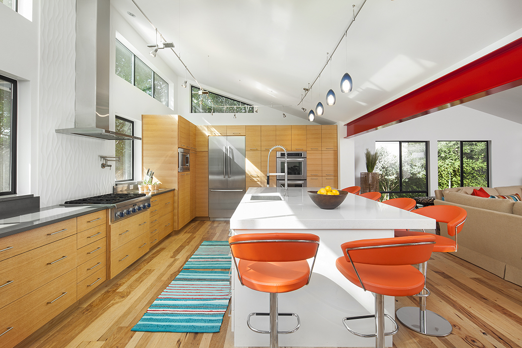
- Engineered – this is indeed REAL wood – NOT laminate (a common misperception). Engineered is one of the most durable and stable kinds of wood floors, and it’s what I use most. It has a solid natural wood layer on top (called the “wear layer”) and it comes in different species, thicknesses, etc. Engineered wood is constructed with criss-crossed sub layers of plywood below that give it stability to prevent expansion and contraction with changes in humidity.
- Solid Wood – this is what you’ll find in old homes in central Austin and elsewhere, and that’s what people like about it. This isn’t as easy to use in a remodel because it’s thicker and less likely to work for transitions to other materials. It is also more prone to warping, cracking, etc. than an engineered wood, although sanding and refinishing is easier than with other materials.
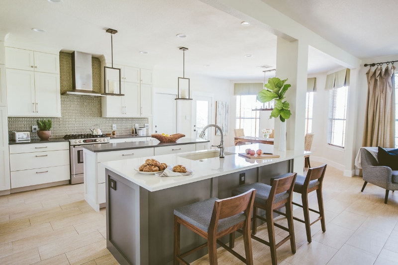
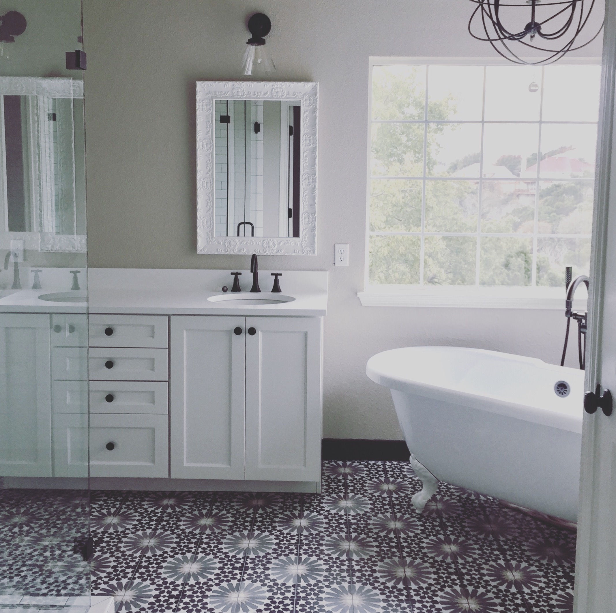
- Manufactured “Wood”– there are many laminates and vinyls out there made to look like wood, and the patterns and colors are becoming more and more realistic. These materials are very durable and most often used in commercial settings. Because it’s not real wood, it’s less expensive and also not sensitive to moisture like real wood. I’ll admit I don’t tend recommend it for most residential clients, because to me it doesn’t indicate the quality I like to see in a residential setting. You’ll also see tile made to look like wood. I have used this a few times with great success (especially in laundry rooms and bathrooms). I lean toward a tile that doesn’t completely try to mimic wood, but instead just has an organic quality about it…
This "wood" tile is a beautiful example of a durable and low maintenance wood look
Budget:
The cost of wood floors varies greatly by type and then by manufacturer and species. Generally speaking, in Texas you can usually get quality wood floors, either engineered or solid hardwood, for anywhere between $10 - $20 per square foot installed. The cost of vinyl planks is about half of that, and tile falls somewhere between the two.
Unfinished vs. Prefinished:
A prefinished product is quick, easy to install, and a bit more “predictable” in color if you find one you like. It is ready-made and factory finished and technicians can install it within a day or two. I recommend buying an extra box so that if planks get damaged they can be replaced. This flooring is not really one you can sand and refinish easily (you can with some choices, but don’t assume that without asking first!). Unfinished flooring takes a little more time. The planks are laid, stain samples are made, and then the entire floor is stained and finished. These floors are easier to sand and refinish down the road if issues arise, but they also tend to be a little more expensive, and it takes time to work out the “perfect stain color”. Clients of mine who choose this method like the fact that the end result feels a bit more like “natural wood” and less like a manufactured product than pre-finished material.
Installation: Floating vs Glue Down:
There are a few different methods of installing engineered wood floors. Click locking engineered planks have special tongue and groove systems that simply lock together. They don’t involve glue during installation and just lay over a foam or cork underlayment. Glue down floors glue directly to the concrete subfloor. There are benefits and drawbacks of each, so without spending too much time on this topic I recommend you talk to a flooring expert to understand the trade-offs for your specific situation.
Maintenance:
We all know that real wood is not a friend to water. Exposure to moisture is the primary cause of damage to wood floors. Having said that, clients are using wood more often these days in kitchens, utility rooms, and powder baths without a problem. Methods of waxing and sealing have improved, but no real wood floor is going to hold up to prolonged water exposure such as that from a flood or a busted pipe. Many clients who love wood are willing to take that risk, knowing that if an incident occurs they’ll have to replace some amount of flooring. On the other hand, if you know in advance that your floor is in a high traffic area and prone to standing water, but you really like the look of wood, it’s a perfect opportunity for vinyl planks or tile made to look like wood.
Color and Grain:
Color is an important factor, as it drives a style direction and needs to work with furniture, cabinets, etc. Grain is a similar consideration. Some woods have a light or barely visible grain (best for contemporary environments) and others have knots and more deeply grained or rugged planks (better for rustic interiors). Here are descriptions of the most common types of trees that I tend to use:
- Maple – reddish brown or yellowish tan. Typically lighter grain.
- Oak – often white, honey, or reddish. Can be heavy grain, or rift cut offers a linear grain that’s nice in contemporary design. I use this often.
- Walnut – dark chocolate brown. Usually lots of variation and flowing grain. I use this in both contemporary and traditional interiors.
- Hickory – light or reddish brown. Often has knots and distressing. I use this in more rustic environments.
- Acacia – deep brown with LOTS of variation! I have used this in both contemporary and traditional environments. It’s best for someone who appreciates movement and color variation.
Surfaces: Textured, Smooth, Hand-scraped:
For a floor that is less slippery, choose a textured surface. There are slip-resistant hardwoods that can prevent falls and are especially valuable for senior citizens. Other than that you’ll see floors that are hand-scraped, which tends to be a traditional or rustic strategy, or those that are smooth, which is what I lean toward in contemporary design. Pay attention to whether the finish is glossy versus matte. These considerations are primarily personal preference, but your designer and/ or flooring expert can provide guidance on what’s best for your specific situation.
Recycled/ Reclaimed Hardwoods:
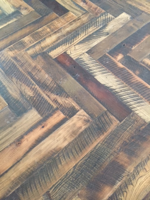
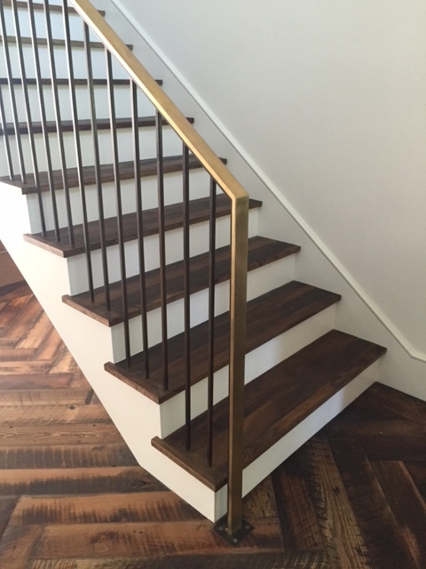
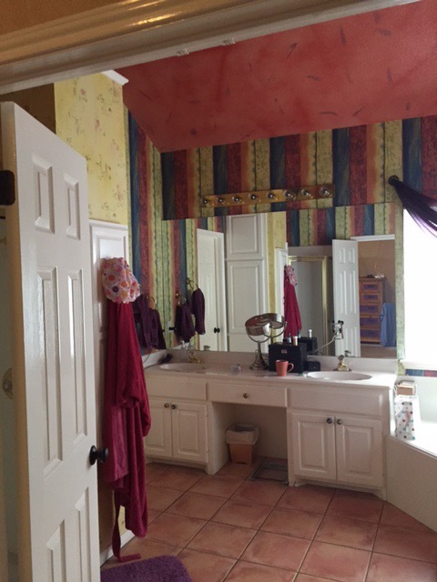
Lately, both for the look and the benefit of the environment, I have used vintage hardwood products that have been removed and reclaimed from old structures. These hardwoods have been cleaned and treated and have fabulous character! I can't wait to get professional photos of this remodel below where I used reclaimed planks. In the meantime – please enjoy these amateur photos courtesy of my iphone…
Hope this has been helpful. In the meantime... best of luck on your flooring journey, and a big thank you to Jessica Kane, a writer for GoHardwood, who collaborated with me on this article.


