Recently we celebrated a milestone on Instagram by offering insight into our favorite LBI paint colors. For every project we curate a specific color palette, but these are the tried and true colors that have succeeded for us time after time. If you like the vibe of our interiors, you’ll be happy to have insight into these ‘go-to’ colors.
Here are the color categories, along with descriptions, examples, and a few cautions mixed in.
Clean Whites: Sherwin Williams Pure White, Benjamin Moore Decorator’s White, Benjamin Moore Simply White.
These whites are white in its purist form. They don’t have yellow or gray undertones, so they read crisp and clean. When selecting whites, pay attention to countertops, sinks, and other ‘white’ materials in the space that could become yellow in comparison.

Benjamin Moore Simply White sets the foundation for walls, trim, and ceilings in this home, so that the client’s art collection can take center stage (artwork by Mallory Page, photo by An Indoor Lady)
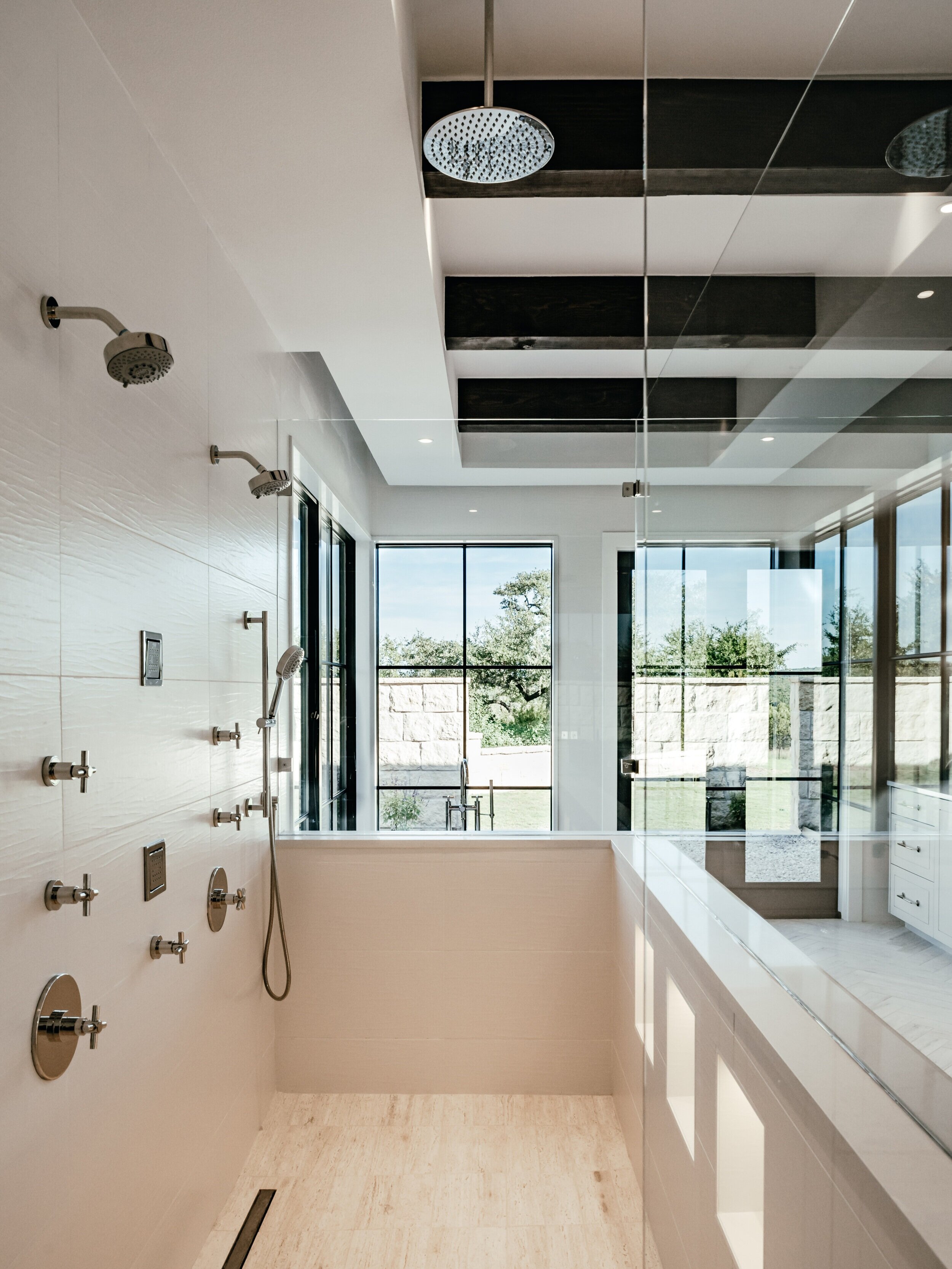
Soft Warm Whites: Sherwin Williams Greek Villa, Benjamin Moore White Dove, Benjamin Moore Intense White
These whites are less “crisp” and more “soft”. They lean warm and can work well with palettes that include organic natural materials.

The sheetrock walls in this home are painted Benjamin Moore Intense White. It works well with the smooth Lueders Limestone walls and the travertine floors. (Photo by An Indoor Lady)
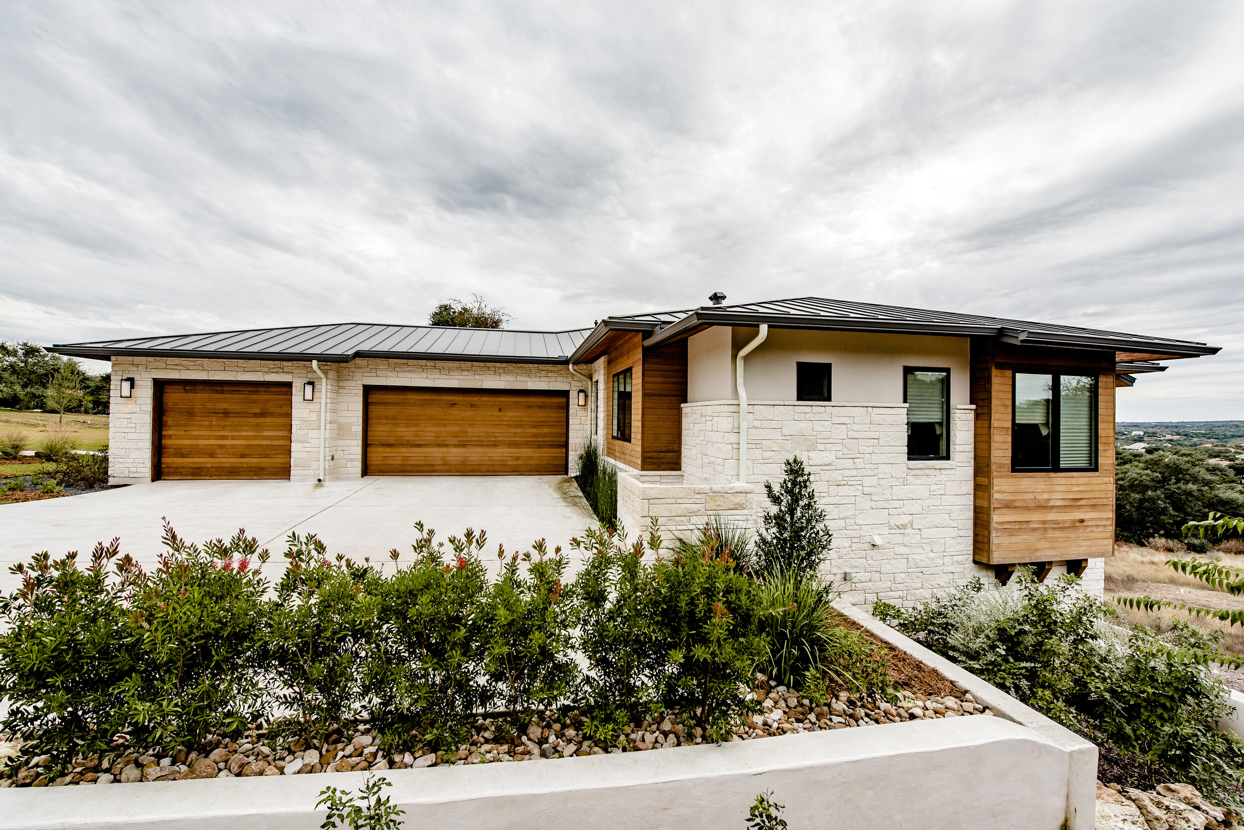
Cool Whites with Gray undertones: Sherwin Williams Drift of Mist, Sherwin Williams Pearly White
These colors are essentially the opposite of “warm white”. With too much warmth next to gray tones, a warm white would look yellow and dingy, so these whites offer that balance of soft but cool.

Since the white in this exterior scheme was side by side with gray siding, we used Sherwin Williams Drift of Mist to keep it soft yet fresh, avoiding the risk of a yellow tint. (Photo by Chase Daniel)
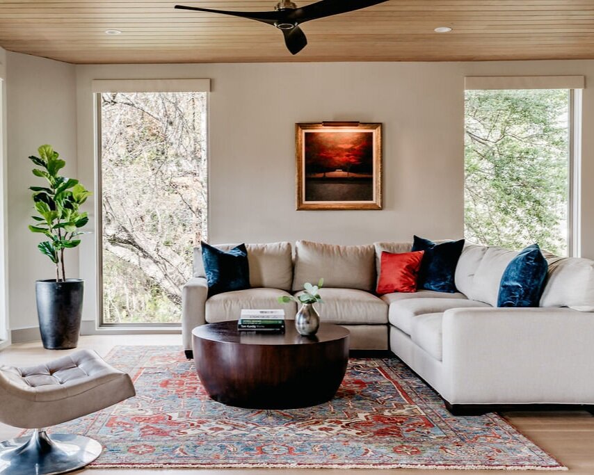
Soft Neutral Gray: Sherwin Williams Skyline Steel, Sherwin Williams Worldly Gray, Sherwin Williams Repose Gray
For spaces where the vibe is neutral but not white , these colors offer a nice balance. The trends in design have gone gray in recent years, but at LBI we are intentionally rooted in timeless design, so when going gray we lean toward warmth and tones that work well with organic textures.

This Repose Gray living room has leather and brass, a gold-toned rug, and fabulous views of the outdoors. Fun fact - the sculpture in the corner is a Remington. Pretty cool! (Photo by David Duncan Livingston)
Charcoal Gray: Sherwin Williams Grizzle Gray, Sherwin Williams Rock Bottom, Benjamin Moore Kendall Charcoal
We love creating a masculine interior with layers of texture and deep moody colors. Charcoal Gray looks great on cabinets and walls, and feels a little less intense than off-black or black.

These Sherwin Williams Rock Bottom walls create a nice richness with the custom walnut bed and nightstands. (photography via my iPhone. Can you tell?)
Off Black: Sherwin Williams Iron Ore, Benjamin Moore Iron Mountain, Benjamin Moore Dragon’s Breath
Sometimes we need a black that doesn’t feel as harsh as black. That’s when we opt for OFF black. Pay attention to the undertones, they can sometimes lean blue-gray or green-gray. That might be okay, but be careful what you put them next to.

This powder room has a Sherwin Williams Iron Ore cabinet, walls, ceilings, and trim. We wanted it to feel rich and moody. Something cool about this Powder - it was the first install of our very own Finery Hardware! It holds a special place in our hearts. (Photo by An Indoor Lady)
True Black: Sherwin Williams Tricorn, Sherwin Williams Black Magic, Sherwin Williams Inkwell
Sometimes there is just no substitute for Black. You need that contrast and pop. These colors are great for that.

The Sherwin Williams Black Magic fascia in this photo does a nice job accentuating the charcoal gray roof and tying it back to the black steel windows and doors.
Deep Blues & Greens: Sherwin Williams Gale Force, Sherwin Williams Naval, Sherwin Williams Cast Iron, Sherwin Williams Jasper, Benjamin Moore Polo
We love these colors for cabinets and molding when a touch of color feels right. These are deeper, masculine blues and greens, so they wouldn’t be described as “colorful”, but they add interest.
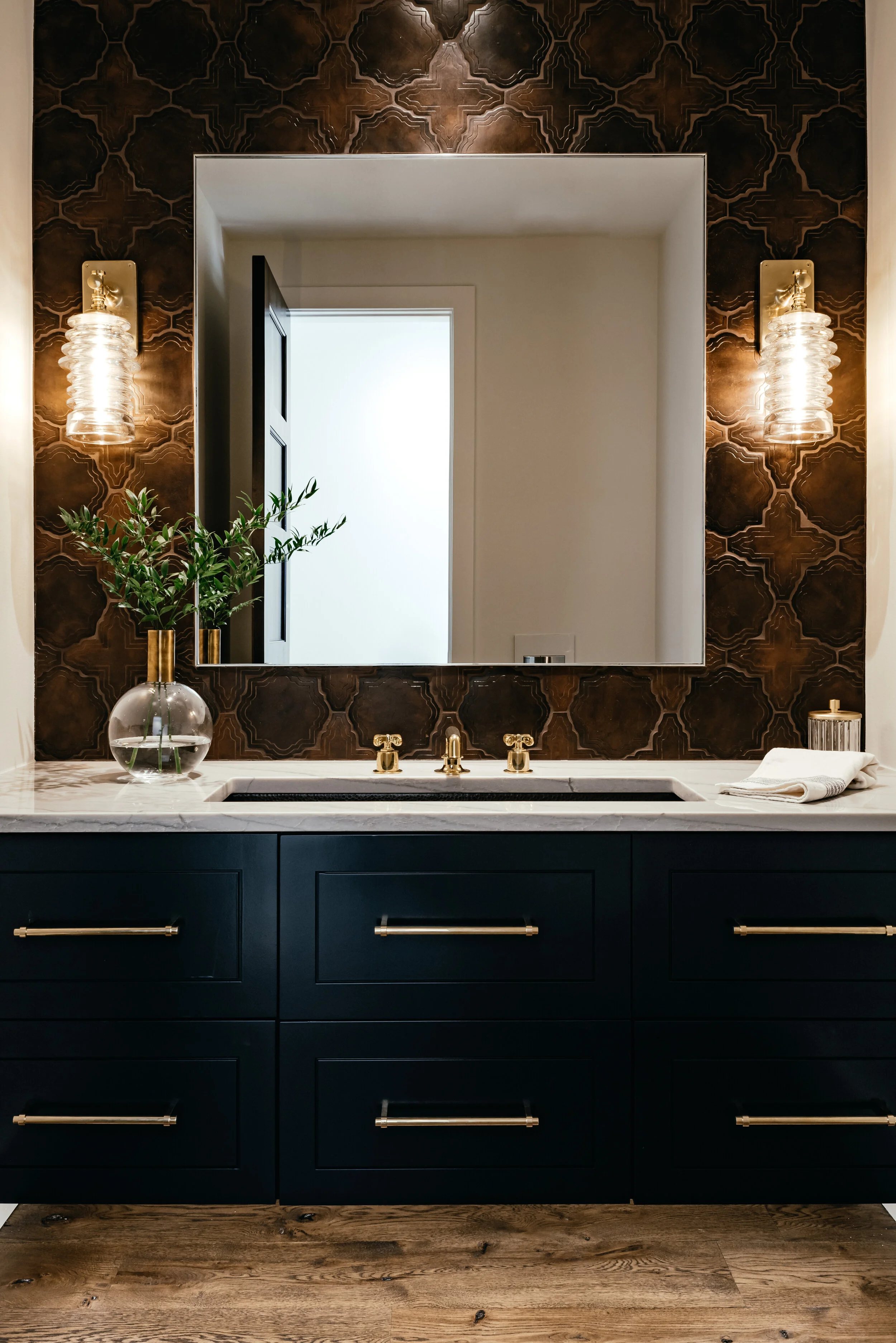
This Benjamin Moore Polo is the perfect cabinet accent in a rich and textural powder. The navy is classic, but the application is contemporary. One of our favorites! (Photo by An Indoor Lady)
We hope you’ll enjoy playing with these! For most conditions you’ll want to review samples, because color involves a relationship with other materials in the scheme (stone, brick, tile, etc.) as well as with the lighting, but hopefully this gives you a good place to start!